It will take sometime to get use to the new feel of the forum guys. Hover the mouse under your name for other links. I will tweak the colors later.
Replies sorted oldest to newest
I do not like the open edit pane below. It is after the fashon of the old comment pages that used to come canned with microsoft frontpage web designer.
Amral.. a nice full banner needed.
Excellent work, Amral.
Amral, it is glacial on my side and i have 100Mbps
Nice changes, Amral; things look less 'cluttered'.
 Navigation Menu: With responsive design, the navigation has to be much more flexible, and as result your site nav menu is automatically adaptive. On large "grids" (a responsive design term for describing larger/wider screen resolutions), like laptops and computer screens, a full-width nav menu will appear. On medium and small grids, the top nav will be replaced with "off canvas" menus that can be triggered from the left and right side of the browser on demand.
You can also control the positioning, size, and fixed nature of the large grid menu.
Breadcrumbs: Breadcrumbs are now consistently used throughout the application to allow the user to easily navigate back within the site.
Icons: Font icons have replaced nearly every image icon. This allows you to easily stylize your icons to match your site design. (You can change font colors in your theme.) The few image icons that remain can be customized via Display Settings. Note that we no longer support icon sets, as a result of this change.
Title Images: Version 2.0 enables much more visual content. Title images are now supported for blog posts, audio clips, and file clips.
Custom Extracts For Blogs: You can create a custom extract for blog posts.
New Display Modes for Blogs and Clips: Admins can choose between a "standard" view and an "image-centric" mode for Blog and Clip lists. When in image-centric mode, titles are displayed on top of title images.
Video and Audio Download Option: Hoop.la now supports downloading video and audio files (excluding clips embedded from 3rd party sources like YouTube), There is a new user permission that controls whether who can download video/audio.
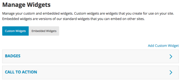
Widget Enhancements: Widgets have been greatly improved. The management of widgets on a particular page is simplified and there is a brand new Manage Widgets control panel, used for managing your custom widgets and embedded widgets (widgets embedded on outside sites). You can now create an embeddable widget in your control panel without having to display it somewhere on your site, as well. The "View All" links at the bottom of widgets have also been made more accurate, to reflect the parameters of the specific widget.
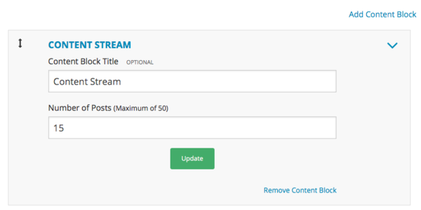
Home Page Enhancements: The home page is now two columns only, to match the layout of the other pages on the site. The wide, left-side column is reserved for a new item- Content Blocks. You can manage the Content Blocks on your Home Page via your Home Page control panel. Available blocks include the all new Content Stream block, which displays recent content from across all of your content modules.
Activity Stream Enhancements: The activity stream can now been segmented into these sections: content, comments or actions (or of course you can view the entire activity stream). Tabs give users control over how they want to view the activity stream.
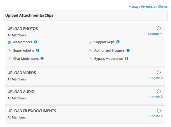
Improved Permissions Management: We've completely revamped the permissions control panel used by Super Admins. Now it is much easier to see how permissions are being applied on your site.
Printer-Friendly: All pages are now automatically printer-friendly.
Comment Sorting Options: You can now sort comments and replies in the following ways: ascending, descending, and popularity.
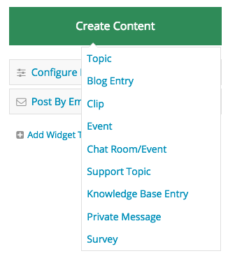
Creating Content Is Easier: Nearly every page includes a POST button, from which any supported content type can be created. In addition, there is a post link in the navigation menu.
 Customizable Group Header: For groups, you can now customize the header completely or you can use the standard header and choose from displaying the group logo or the site logo.
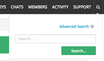
Search Integrated In Navigation Menu: Search is now an integrated part of the navigation menu.
 Member Profile Refreshed: The member profile page has been completely overhauled, featuring a larger user avatar, tabs for browsing information about the user, admin-set widgets, and more.
Custom Page Enhancements: If you choose to wrap a custom page in the standard page shell, the standard right-side widget column will be available for you to use. Widgets are unique per custom page. In addition, you can set your own custom CSS and HEAD code.
Admin Control Panel Changes: The admin control panel pages have been re-organized so it is easier to find what you are looking for. In addition, the admin control panel pages use a stock theme (not your theme) so it is more evident that you are in the control panel and so that you cannot "break" the display of the control panel pages if you do something wrong in your theme or settings.
jQuery: Hoop.la now only uses jQuery as its javascript library, which makes it easier for customers to reference jQuery when using their own jQuery tools on pages.
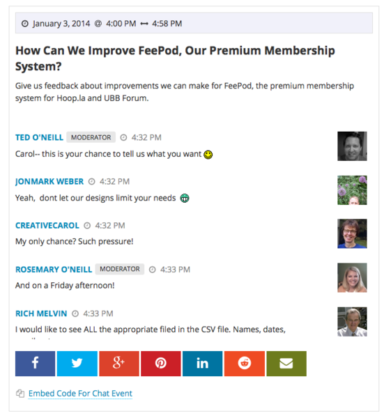
Improved Chat Interface: Chat rooms/events are responsive and now allow access all elements of a chat (chat pane, roster, moderation queue) on all devices.
Dialogs Are Now "Private Messages": we've renamed dialogs so it is clearer what they are. ![]()
Wide Calendar Grid: when viewing the calendar on a large screen, a much wider, improved calendar grid is displayed.
Page View Counts Available: each content module now has an option to display page views on each content page.
There are many other changes in 2.0, and every single interface was redesigned in this release, with the goal of providing a responsive, intuitive interface that any user can understand. We hope you love it as much as we do!
If you are an existing customer, your site will be upgraded to 2.0 sometime this week, as we have communicated via email previously. If you have questions about your upgrade, please post to our support site.
Stormborn posted:Amral, it is glacial on my side and i have 100Mbps
I also notice that.
Stormborn posted:Amral, it is glacial on my side and i have 100Mbps
Yes, it is slow on my side too. Hopefully, it's just the first day jitters and it speeds along once they have everything settled.
Mars posted:Stormborn posted:Amral, it is glacial on my side and i have 100Mbps
Yes, it is slow on my side too. Hopefully, it's just the first day jitters and it speeds along once they have everything settled.
Oh, is the slowness y'all talking bout. The word "glacial" had me thinking bout ice and iceberg and dazzling eyes but I was hesitant to ask wha Stormy meant. I think I'm getting glacial on the uptake.![]()
Amral
How do one post a source with just the word -- SOURCE -- showing.
I tried a few times, but the entire link from {{url}} to {{/url}} showing up.
Thanks.
SourceTest source http://www.thestar.com/
I think them fellas already used to it....insults flying back and forth like nothing changed![]() ...they aint got time to complain about the site...hopefully they don't figure out the complaint button...but ah doubt that
...they aint got time to complain about the site...hopefully they don't figure out the complaint button...but ah doubt that
Demerara_Guy posted:Amral
How do one post a source with just the word -- SOURCE -- showing.
I tried a few times, but the entire link from {{url}} to {{/url}} showing up.
Thanks.
good u stay off go to bollywood
Admins - how do I sign in/out of this site? Looks like I was signed in during the conversion and now I don't know how to sign out. Thanks.
Bibi Haniffa posted:Admins - how do I sign in/out of this site? Looks like I was signed in during the conversion and now I don't know how to sign out. Thanks.
Click on your name at Top and select Sign out.
Hmmmm. That did not work. I clicked on my name and my profile came up. There is no button to sign out.
Bibi Haniffa posted:Hmmmm. That did not work. I clicked on my name and my profile came up. There is no button to sign out.
Hover your mouse over your name in the top right, then move the mouse down to sign out.
Bizarre. I did that also and it is saying I am offline. But I cant be if I am writing here. Will try to figure it out later.
On the uppermost blue bar there are 3 white lines. Click on those lines and you will see BIBI HANIFFA followed by Profile Page, Pending Posts etc all the way down the list to Sign Out.
Bibi Haniffa posted:Bizarre. I did that also and it is saying I am offline. But I cant be if I am writing here. Will try to figure it out later.
Settings
Time Zone Assigned To You
Eastern Standard Time
Privacy Settings
Mars posted:Bibi Haniffa posted:Hmmmm. That did not work. I clicked on my name and my profile came up. There is no button to sign out.
Hover your mouse over your name in the top right, then move the mouse down to sign out.
Bibi its on the top left hand cornet under your name at the bottom of the scroll down menu. I don't know if it's different since I am using a handheld. Check it out.
Gilbakka posted:On the uppermost blue bar there are 3 white lines. Click on those lines and you will see BIBI HANIFFA followed by Profile Page, Pending Posts etc all the way down the list to Sign Out.
Eh Eh Gil,
Like you become an expert on Computa and Tek stuff. GNI does not need a Geek Squad Now. We have we on Computa squad.
Gilbakka posted:On the uppermost blue bar there are 3 white lines. Click on those lines and you will see BIBI HANIFFA followed by Profile Page, Pending Posts etc all the way down the list to Sign Out.
Gil - you gave me the correct answer. It worked. You really putting the young ones to shame on this computaaaaa stuff. Thanks anyway!!!!
the default avatar size is 77 x 77 pixels. They will still look good at 60 and give us at least five more lines on the page and decrease the white spaces
Just want to make sure the important things work. 
Bibi Haniffa posted:Gilbakka posted:On the uppermost blue bar there are 3 white lines. Click on those lines and you will see BIBI HANIFFA followed by Profile Page, Pending Posts etc all the way down the list to Sign Out.
Gil - you gave me the correct answer. It worked. You really putting the young ones to shame on this computaaaaa stuff. Thanks anyway!!!!
You're welcome, comrade Bibi.
yuji22 posted:Gilbakka posted:On the uppermost blue bar there are 3 white lines. Click on those lines and you will see BIBI HANIFFA followed by Profile Page, Pending Posts etc all the way down the list to Sign Out.
Eh Eh Gil,
Like you become an expert on Computa and Tek stuff. GNI does not need a Geek Squad Now. We have we on Computa squad.
Shut yuh jealous brahmin rass. Yuh tek me fo one chamar but me is one Chatree wid a capital c. ![]()
Amral / Raymond
My icon is not showing on the current visitor list.
Demerara_Guy posted:Amral / Raymond
My icon is not showing on the current visitor list.
Check your online status on your profile.
Everything is fine, but still not on the current visitor's list.
Mitwah, you need help understand the forum, sir?
This site slack, I don't see no nakid skin pictures.
Demerara_Guy posted:Everything is fine, but still not on the current visitor's list.
Under Personal Settings you probably have : Keep Your Online Status Private ticked off.


